
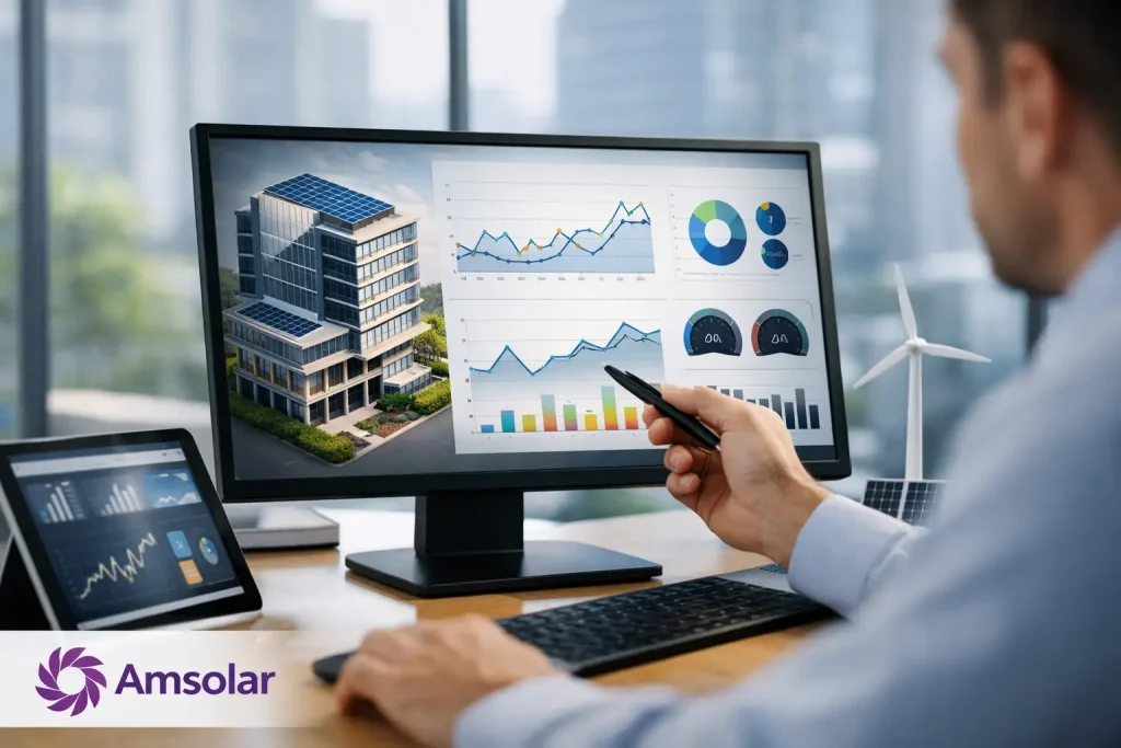
Practical Guide to Building Energy Dashboards
Key takeaways: An energy dashboard should answer decisions, not merely display data. Start with clean interval data from the utility meter, solar inverter, battery, and major loads. Prioritize a small set of cost and performance indicators, then connect each alert or chart to a practical action.
At 2:00 p.m., a solar array may be producing strongly while a home or facility still imports expensive electricity. Without visibility into the load profile, battery status, and timing of consumption, that gap is easy to miss. This guide to building energy dashboards explains how to turn raw energy readings into a working control surface for lower bills, stronger solar returns, and more predictable energy use.
The best dashboards are not designed as a collection of colorful gauges. They are engineered around the questions an owner, operations team, or energy manager needs to answer quickly: Where is electricity going? What is driving cost? Is the solar system delivering as expected? When should stored energy be used, and when should it be preserved?
Start With the Decisions the Dashboard Must Support
A useful dashboard begins before a single meter is connected. Define the decisions it needs to support. For a landed-home solar owner, the priority may be recognizing daytime self-consumption, identifying high evening demand, and checking whether battery storage is reducing grid reliance. For a commercial site, the focus may shift toward peak demand, production-related loads, equipment schedules, and energy cost allocation.
This distinction matters because the same number can mean different things. High solar production is positive only if it offsets useful consumption, charges a battery at the right time, or otherwise improves financial outcomes. A dashboard that celebrates generation while ignoring imported energy can create a misleading picture of performance.
Build the primary view around four questions: how much energy the site consumed, how much solar produced, how much electricity came from or went to the grid, and how much energy the battery charged or discharged. Those values create the energy story. Once that story is clear, cost, carbon impact, and equipment performance become easier to interpret.
For most users, daily, monthly, and billing-cycle views are more valuable than minute-by-minute charts. Short-interval data still matters, especially for diagnosing unusual loads or controlling batteries, but it should support analysis rather than overwhelm the main screen.
Build a Data Foundation You Can Trust
A dashboard is only as credible as the data feeding it. Solar inverter data alone is not enough because it shows production, not where energy went. Add a site-level meter that measures import and export, then include battery data where storage is installed. Submetering major loads can provide another level of value when air conditioning, water heating, EV charging, pumps, or production equipment materially affect consumption.
Data points should use a consistent timestamp, time zone, unit, and reporting interval. A common failure is combining five-minute inverter readings with hourly utility data and treating them as directly comparable. The resulting charts may look polished while masking gaps, duplicated readings, or incorrect totals.
Validate the system at commissioning and repeat the check after material electrical changes. Daily solar generation should be plausible for the installed system size and weather conditions. Site consumption should align with the main meter. Battery charge and discharge totals should correspond with changes in state of charge, allowing for normal conversion losses.
Amsolar approaches monitoring as part of energy performance, not an afterthought to installation. That engineering mindset is useful whether the dashboard serves a home, a retail site, or a multi-building operation: meter the energy path first, then make the visualization layer earn its place.
Choose the right level of detail
More sensors do not automatically produce better decisions. Submetering every circuit may be appropriate for a complex facility with variable processes, but it adds cost, maintenance, and data-management work. For a residence, a whole-home meter, solar inverter feed, battery feed, and one or two high-impact circuits often provide a far clearer starting point.
The right level depends on the size of the energy opportunity. If a single air-conditioning system drives a large share of late-afternoon demand, measuring that load can expose a direct savings opportunity. If household loads are modest and diverse, whole-home trends may be sufficient.
Design the Main Screen for Fast Interpretation
The home screen should make energy flow visible at a glance. A simple real-time view can show solar generation feeding current loads, battery charging or discharge, and grid import or export. This is useful for immediate awareness, but it should sit alongside context. A homeowner needs to know whether the current pattern is normal for the time of day and whether it improves the monthly bill.
Place the most decision-relevant indicators at the top: current site load, solar output, grid import or export, battery state of charge, and estimated energy cost for the current period. Use plain labels. “Grid import” is clearer than an abstract icon, and “Battery available” is more useful than a technical metric without an explanation.
Below the real-time view, use trend charts to show the day’s energy profile. The most effective version layers consumption and solar generation, then marks battery charge and discharge periods. Users can quickly see whether solar production overlaps with demand, whether storage is carrying evening loads, and when grid imports rise.
Avoid forcing every metric onto one screen. Detailed inverter efficiency, individual string performance, voltage behavior, and sensor health are valuable for technical review, but they belong in a diagnostics view. Separating operational information from engineering diagnostics keeps the main dashboard useful without hiding the evidence needed to investigate an issue.
Turn Monitoring Into Cost Control
The practical purpose of a dashboard is action. Every alert should be connected to a defined response. A sudden rise in overnight baseload may indicate equipment left on, a failing appliance, or an unexpected operational schedule. Lower-than-expected solar output may point to shading, soiling, a communication issue, or an equipment fault. Repeated battery discharge before the expensive part of the evening may suggest that control settings need refinement.
Set alerts sparingly. Too many notifications train users to ignore them. Start with conditions that have a clear financial or operational consequence: sustained grid import above an expected threshold, solar production materially below its expected range, battery state of charge outside its planned operating window, or a loss of communication from critical equipment.
A cost-focused layer is particularly valuable because kilowatt-hours alone do not explain financial performance. The dashboard should estimate the cost of imported electricity, the value of solar used on site, and the role of battery dispatch in avoiding higher-cost periods. These figures are estimates until reconciled against billing data, but they make the economics visible between statements.
Where AI-driven controls are available, the dashboard should also explain what the system is doing and why. If the battery is holding charge for later demand, show the forecast or operating rule behind that choice. Transparent control logic builds confidence and helps owners distinguish an intentional strategy from a system problem.
Review Performance and Improve the Design Over Time
An energy dashboard should improve as the site changes. Review monthly performance against a baseline that accounts for seasonal weather, occupancy, operating hours, and new equipment. A higher consumption total may not be a failure if the site added an EV, extended production hours, or shifted loads from another fuel source. The question is whether the energy system is operating as intended and whether cost per useful activity is improving.
Use monthly reviews to identify one actionable opportunity at a time. It may be shifting a flexible load into solar hours, adjusting battery reserve levels, changing air-conditioning schedules, or investigating a rising overnight load. Small, verified changes compound over the life of a solar and storage system.
The strongest dashboards make energy visible without making the user become an energy analyst. When the data is accurate, the layout is disciplined, and each insight points toward a practical decision, monitoring becomes a reliable part of everyday cost management rather than another screen to ignore.
